The winning designer has their art featured on HALF A MILLION cartons and Limited Edition merch, be awarded a cash prize of $2,000 and a limitless supply of yinzer street cred. Winner was chosen based off of a combination of 40% social media votes and 60% the Turner's team.
I won 3rd place in their 2025 contest! It was a lot of fun getting to brainstorm and create some brand packaging for such an iconic PGH company.
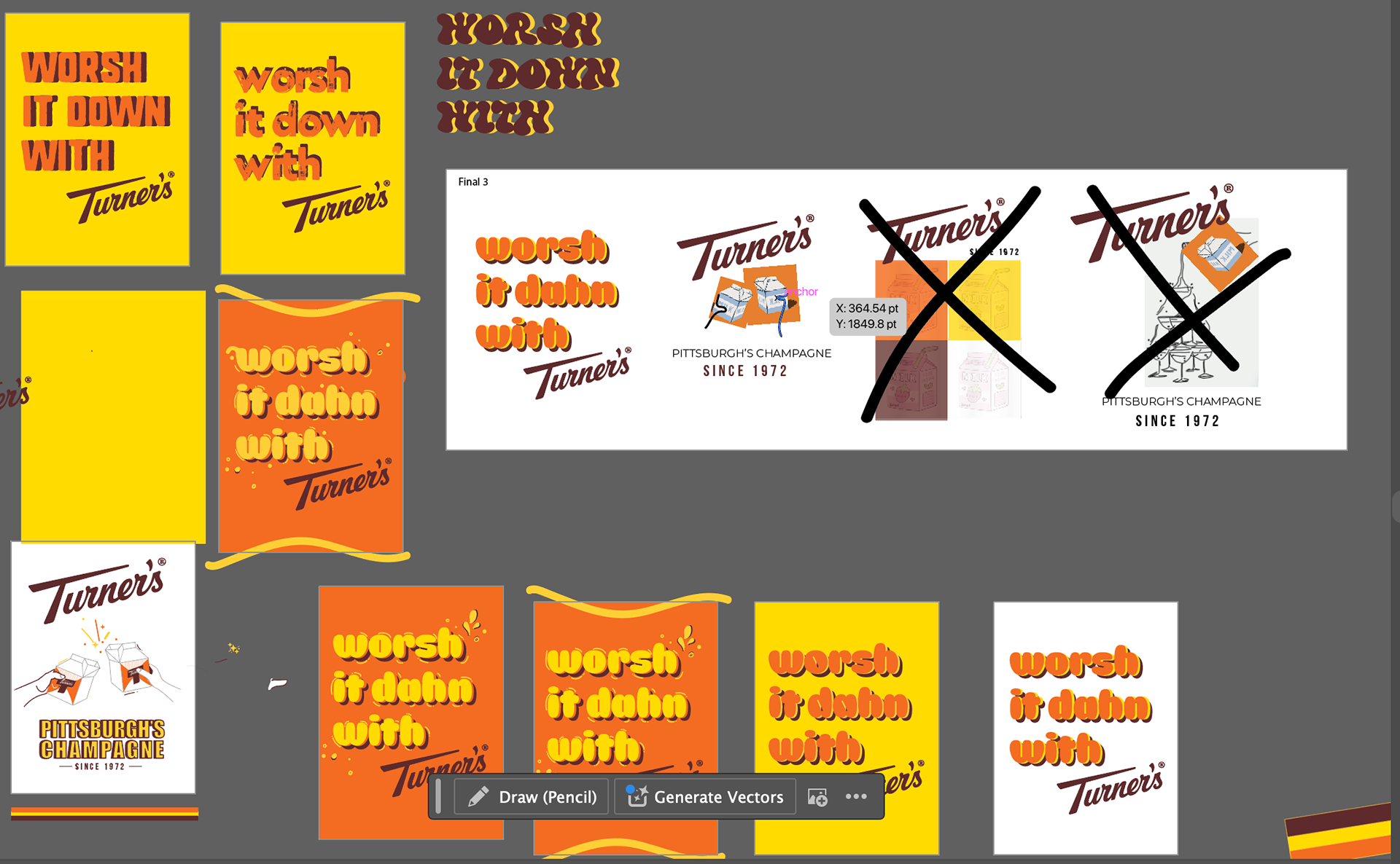
the Creative Process
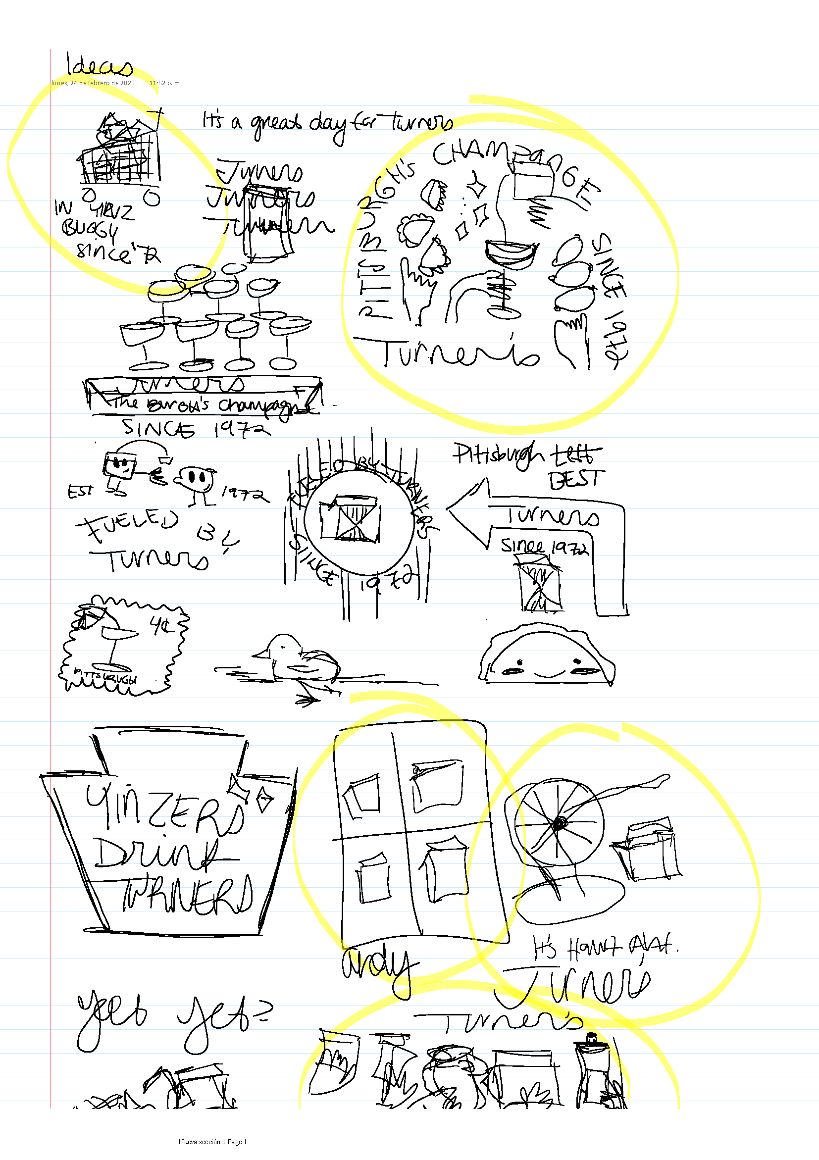
My creative process starts with either a mood board or a sketch. It really depends on the context of the project. Due to the nature of this one being more illustrative - it was definitely a sketch situation. After gathering research from the Turner's website and taking a look at their social accounts, I was able to gather important info about their brand identity, values, and draft up some sketches that I felt would accurately represent them in a way that made sense. Although it looks like a lot of hooplah - surprisingly enough my sketches it made sense to me.
Instead of wasting a lot of time on drawing everything out from the sketch phase, I made a quick mockups of what each idea might look like and I could tell a little better whether I felt it had any potential. From there, I narrowed down my ideas and focused on two main concepts. After testing different compositions, fonts, color combinations (staying within print restrictions and Turner's colors ofc), getting feedback, I finally felt content with my final submissions.
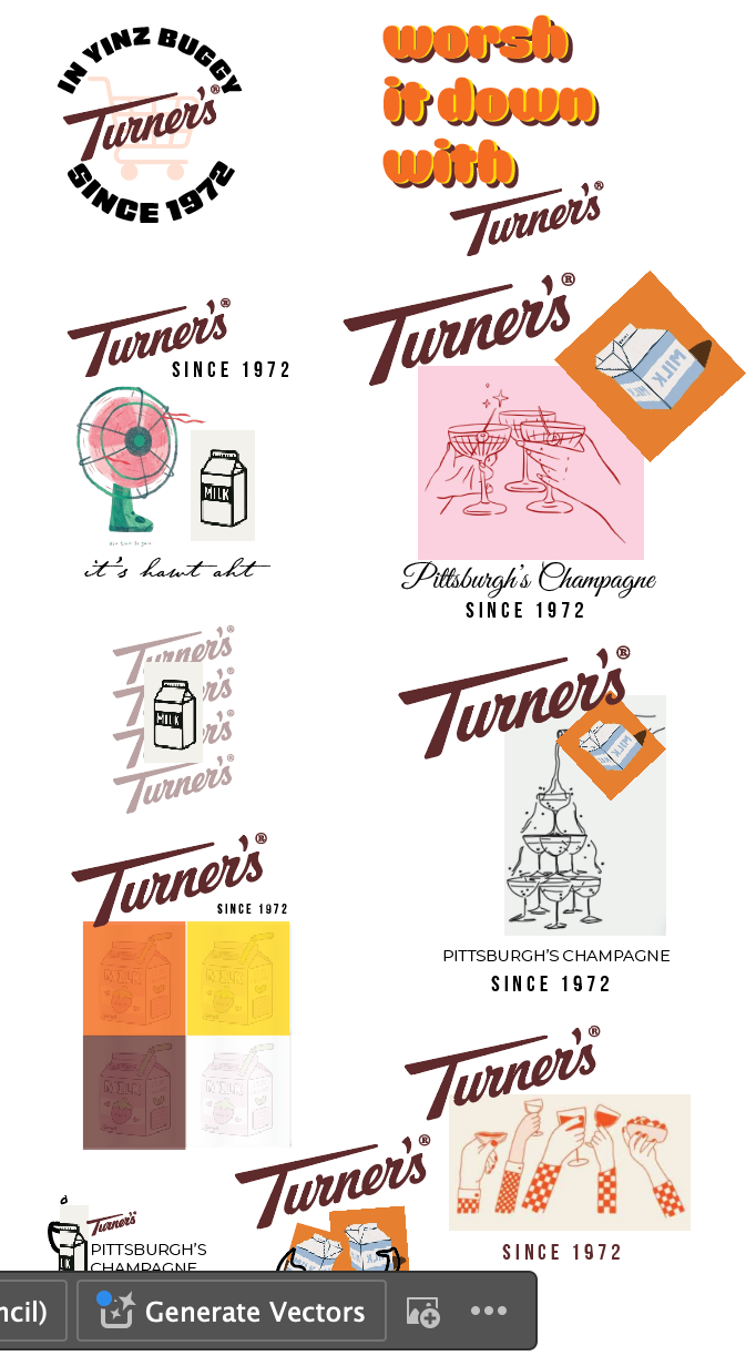
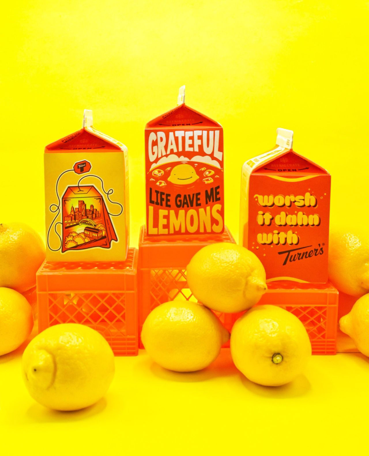
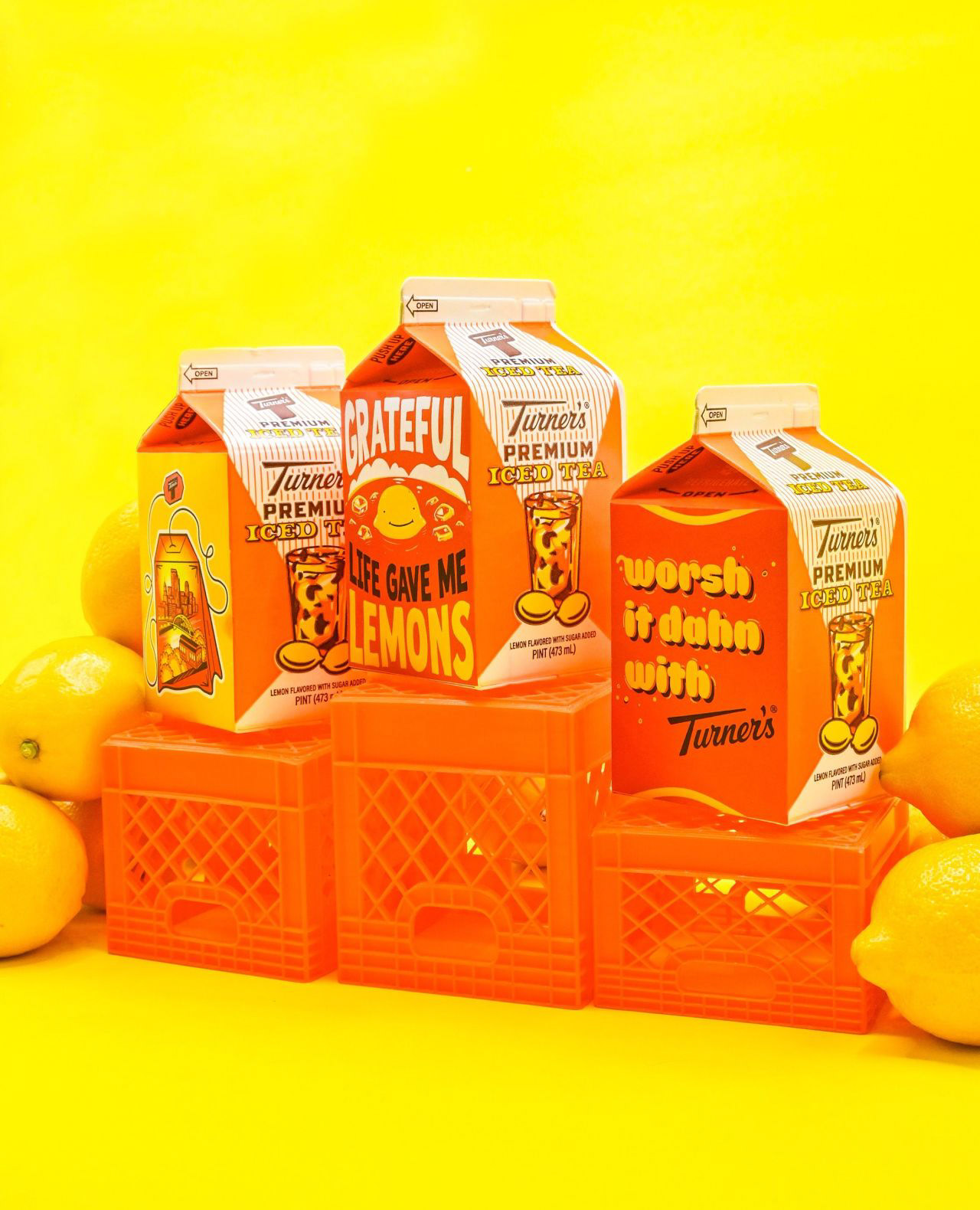
Final Designs
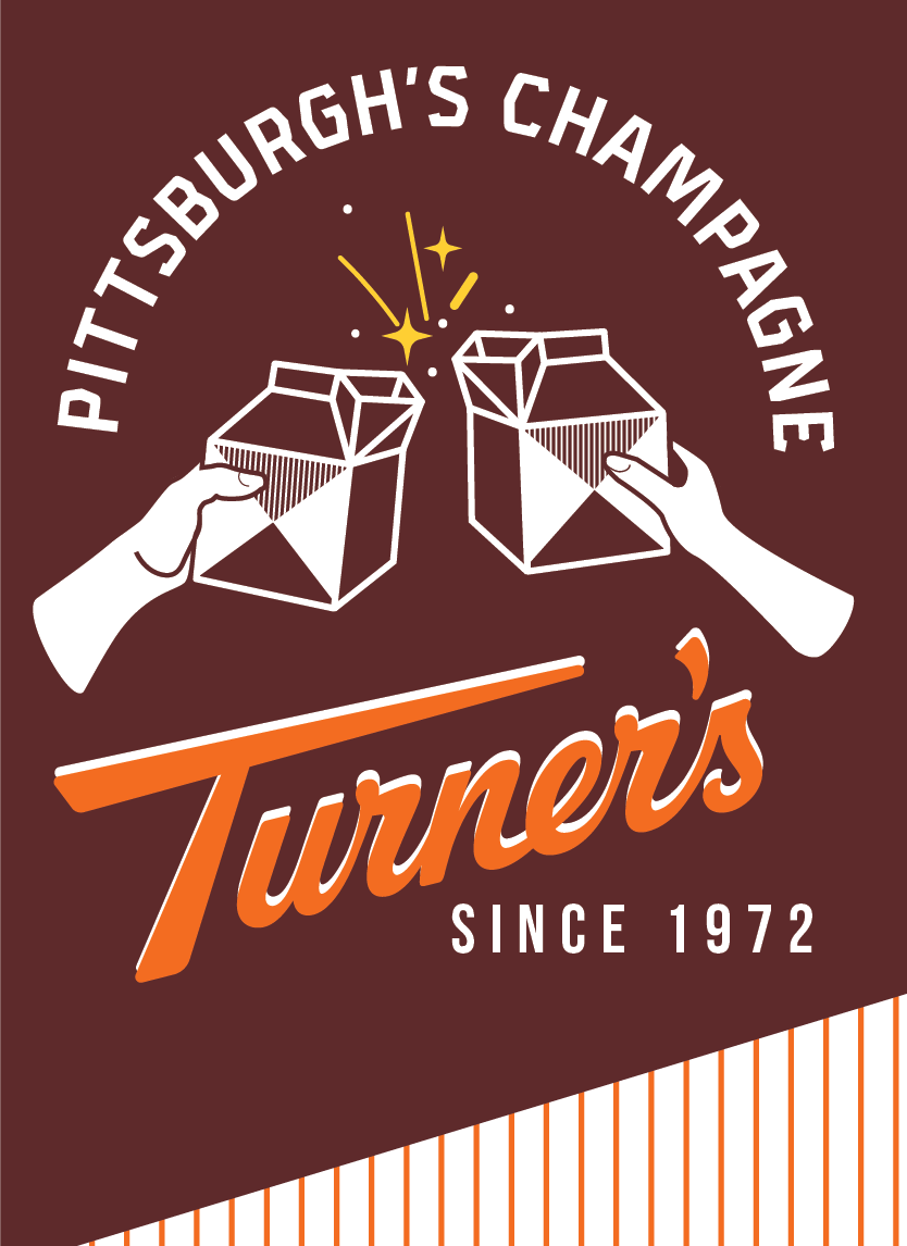
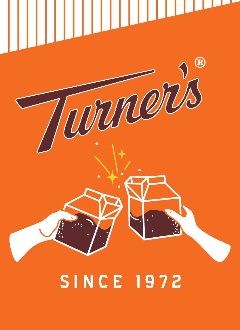
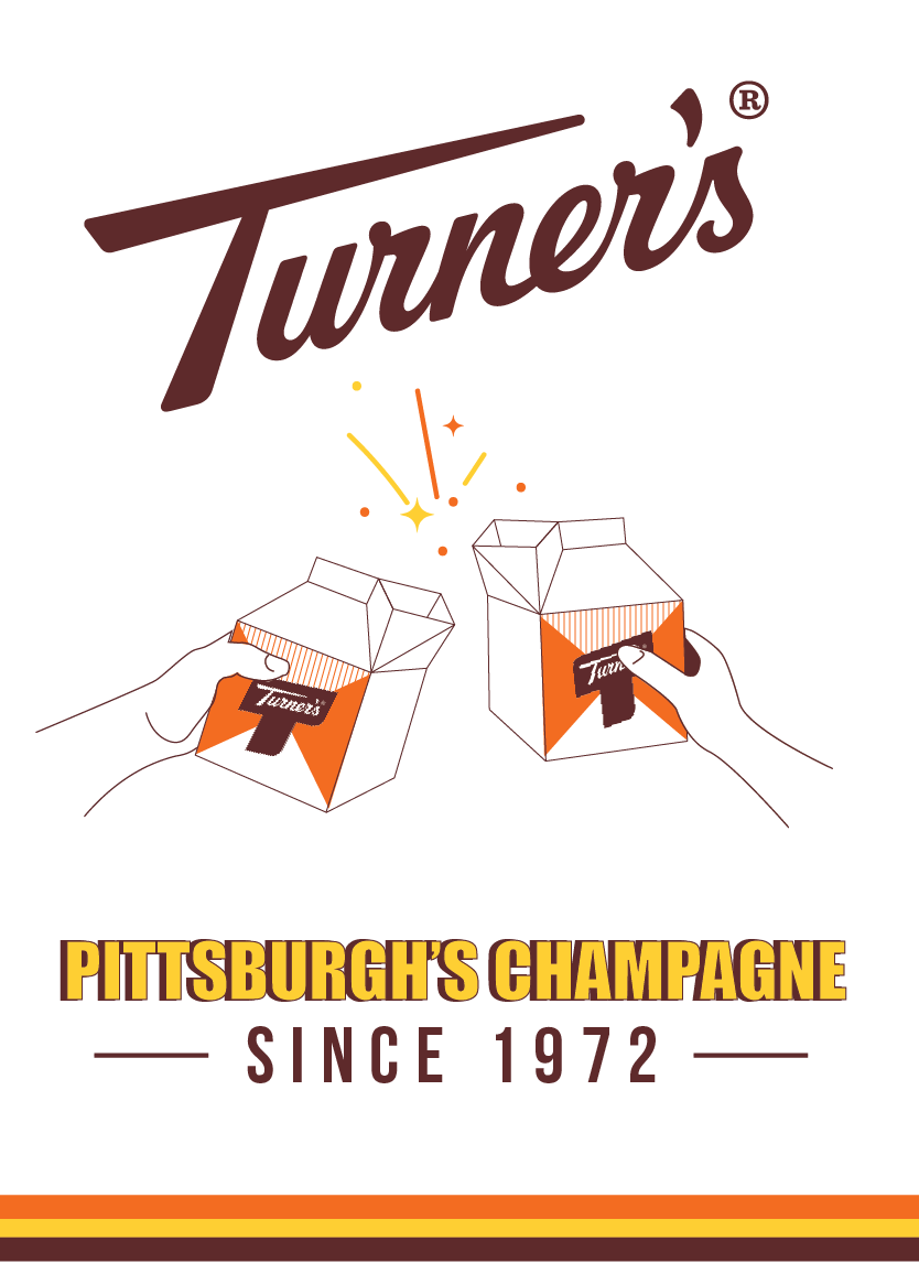
MY FAVORITE & WHY
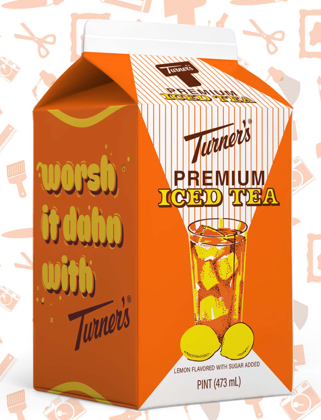
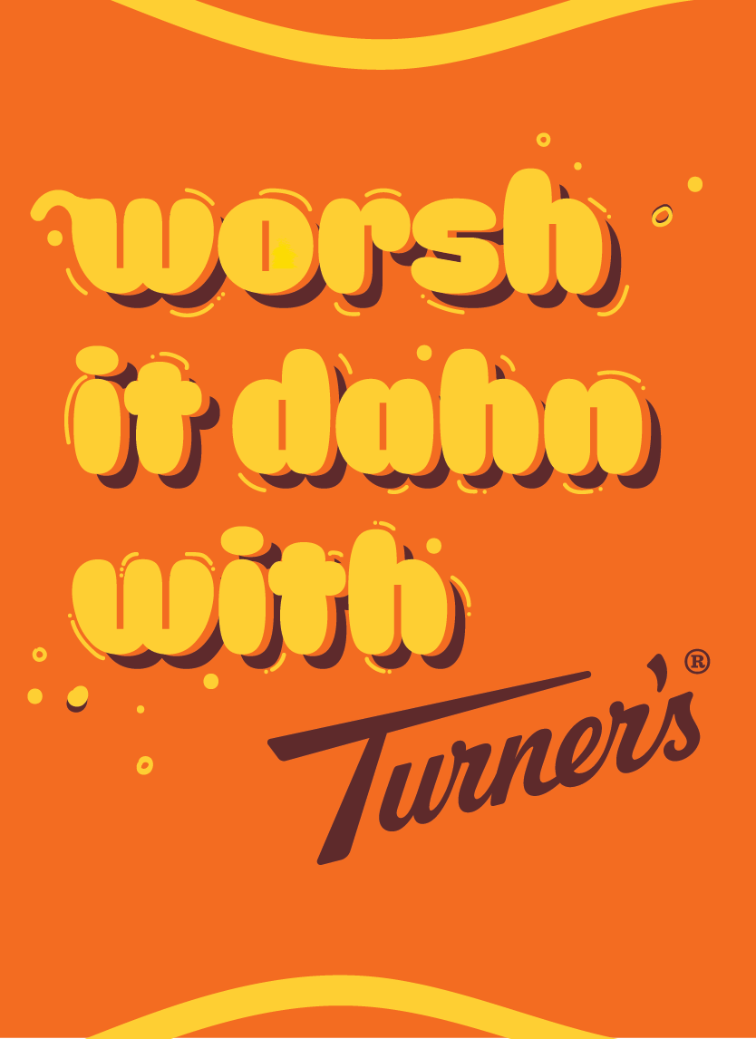
Pittsburghers are know for something called Pittsburghese. It’s their own dialect of *ahem* “correctly” pronounced words. Most famously, we have yinz (you, plural), slippy (slippery), and nebby (nosy).
While Pittsburgh is known for its legendary sports teams, stunning skyline, endless bridges, and iconic landmarks, I wanted my design to reflect what makes the steel city different - the culture. There’s something special when you hear some Pittsburghese out in the wild. I admit, sometimes it doesn’t even sound like English. But when I land in the Burgh and hear a distant “I’m headed dahntahn” - there’s no denying that I’m back home. 🖤💛
So no, there were no spelling mistakes. It’s just a fun, bubbly, bright design with a nod to those who’ve backed the brand since the beginning: the Yinzers.